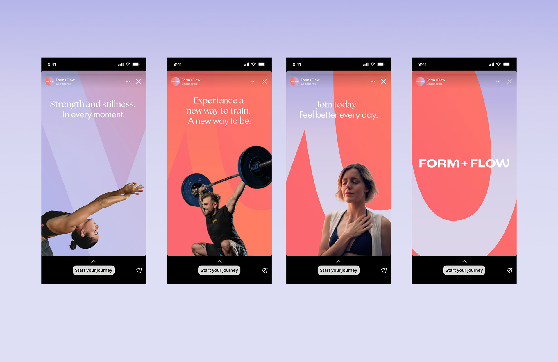
The client is a new gym start-up looking for a brand identity and full rollout to accelerate their growth. The gym is unique for building not just physical, but also mental fitness. The challenge is to design a visual identity that is true to the gym's mission, and feels different from traditional gym brands, which the target audience finds off-putting.
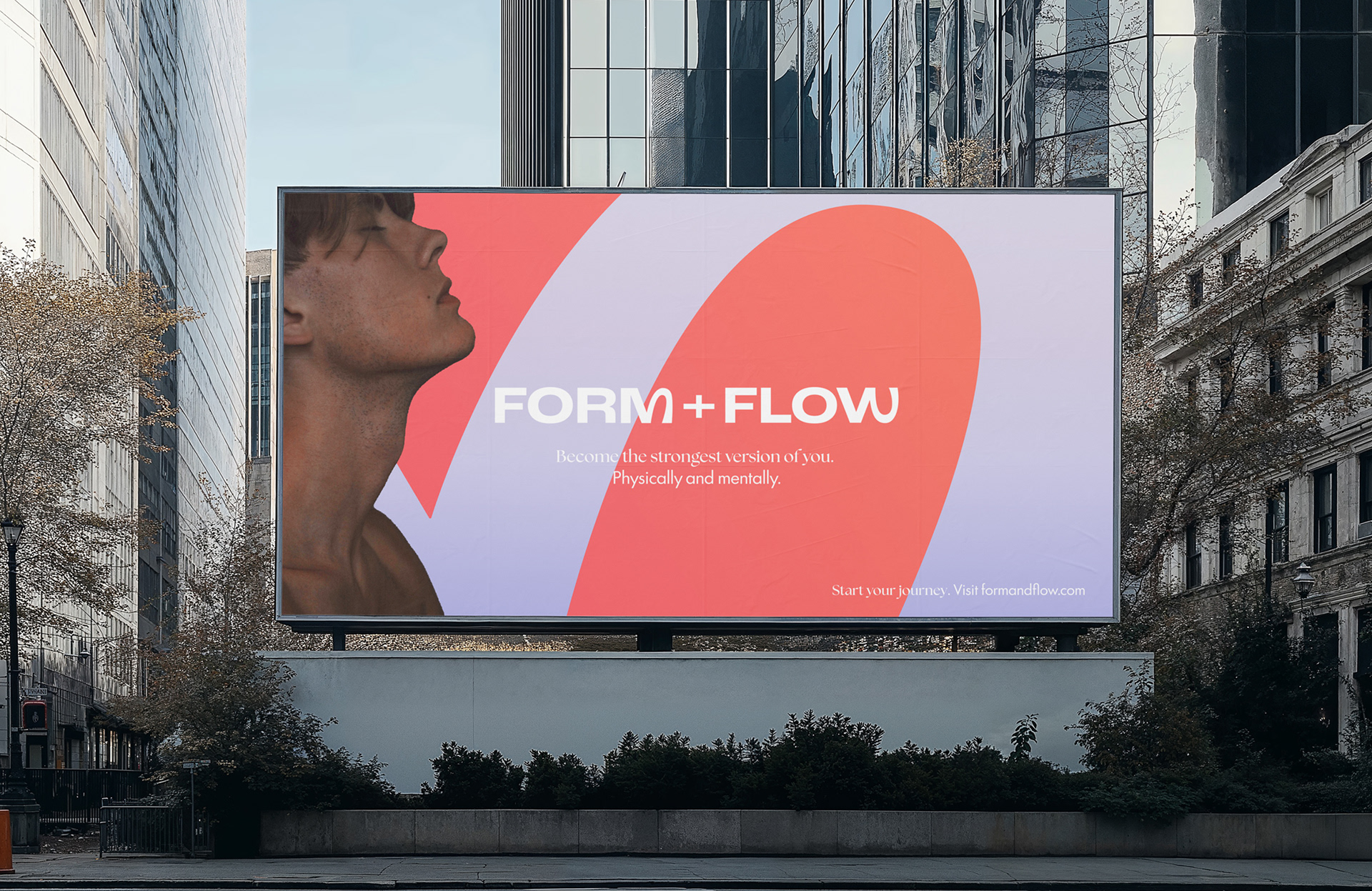
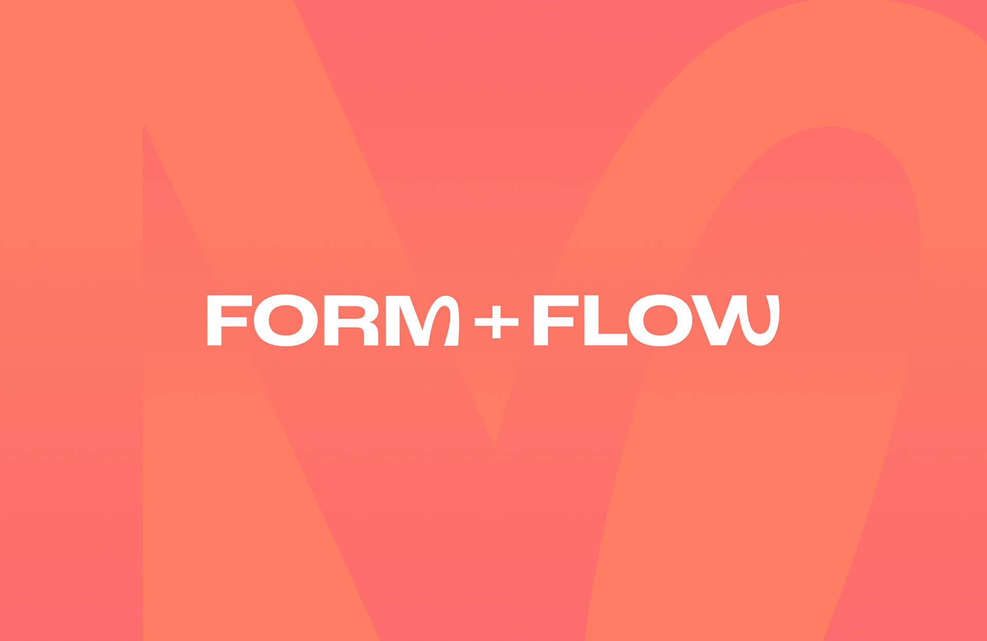
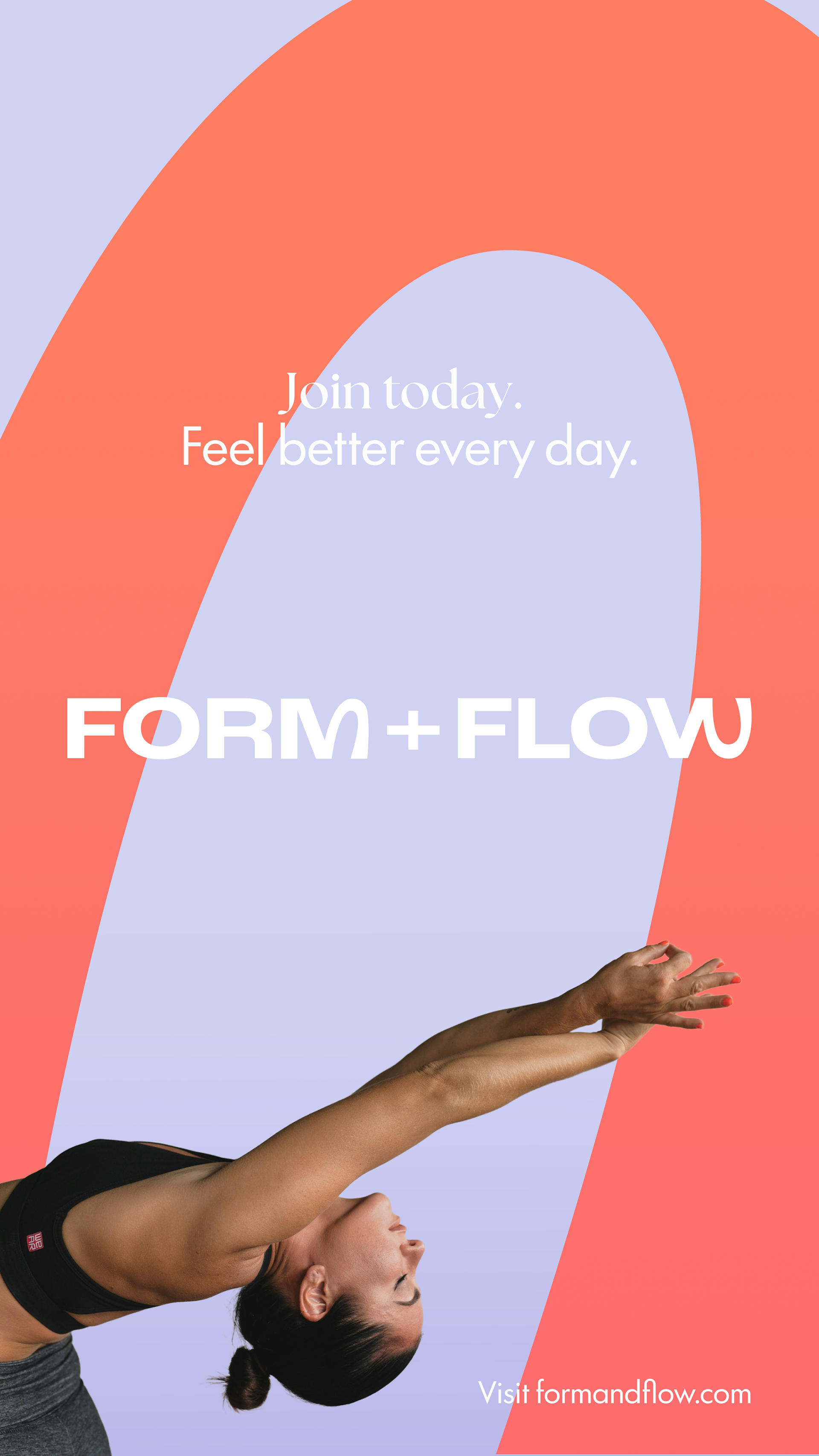
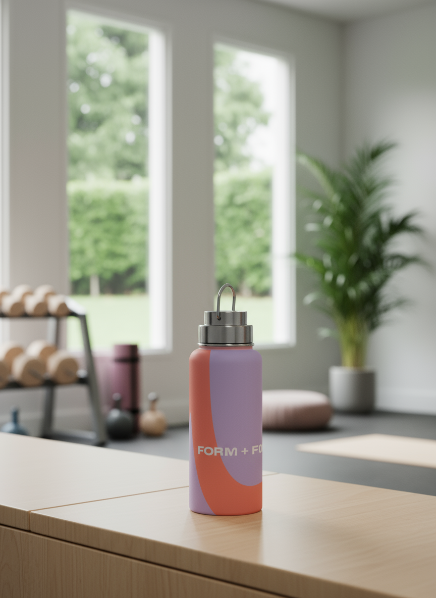
The brand FORM + FLOW is a play on the duality of wellness, the physical form and mental flow. The transitions from angular shapes to smooth curves represent the concept visually. The pairing of serif and sans serif typefaces extends the concept of duality further.
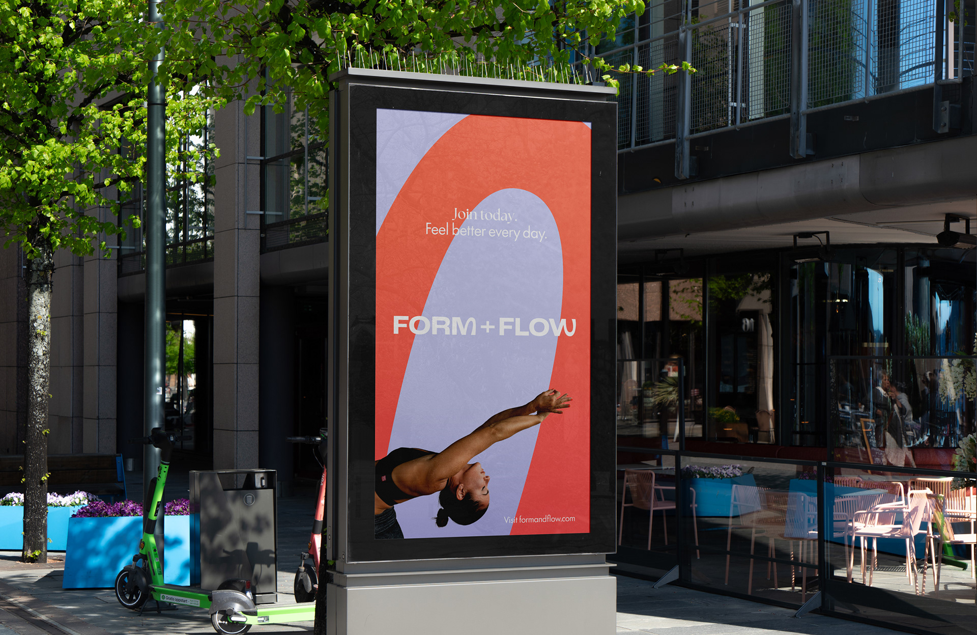
The shapes are complemented by contrasting a hot coral with a cooler lavender, reiterating the duality and moving away from dark and aggressive colours often used in gym branding.
This project was completed as part of the Shillington Graphic Design course.