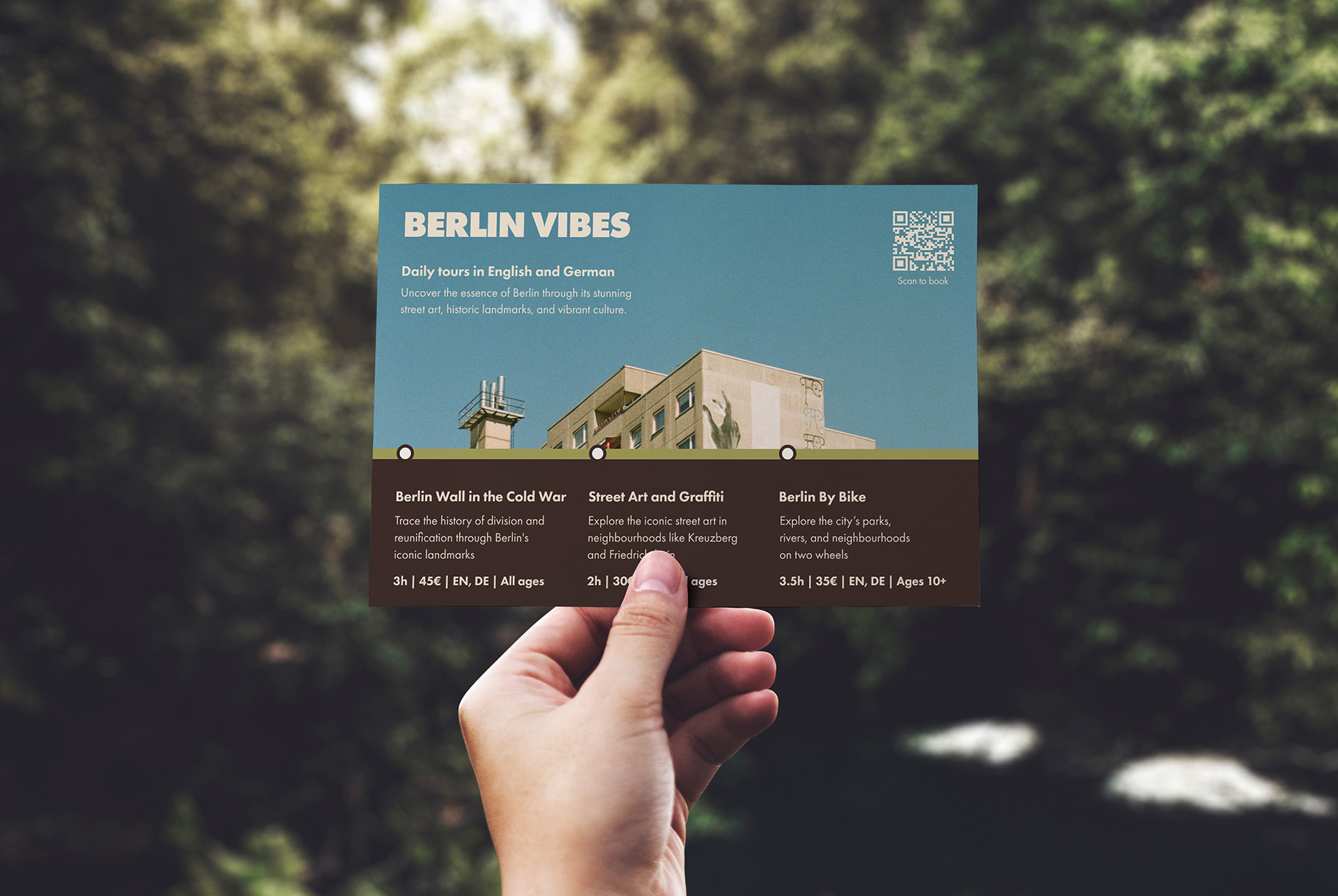
Berlin Vibes is a tour operator whose destination tours are tailored for audiences like history buffs, art lovers and culture enthusiasts. The client is looking for a website and marketing collateral to promote and sell their services. The challenge is to create a design that conveys a strong sense of place, without using cliches often associated with Berlin.
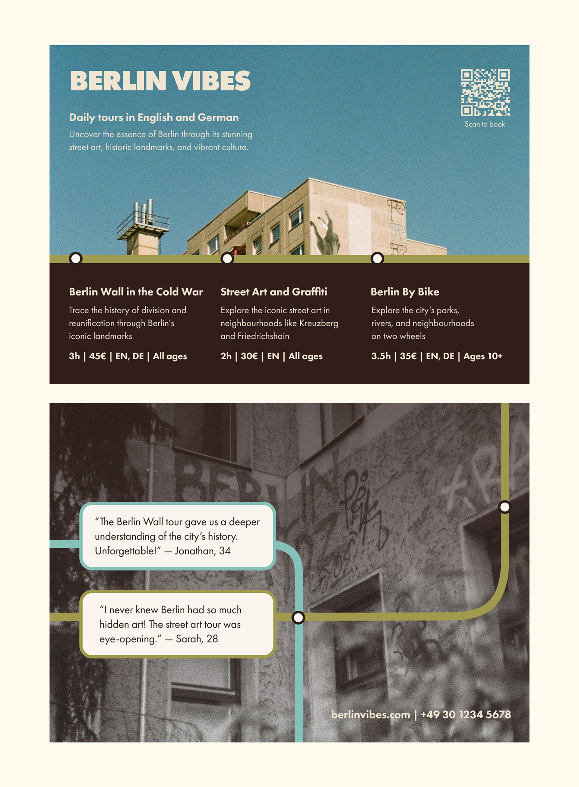
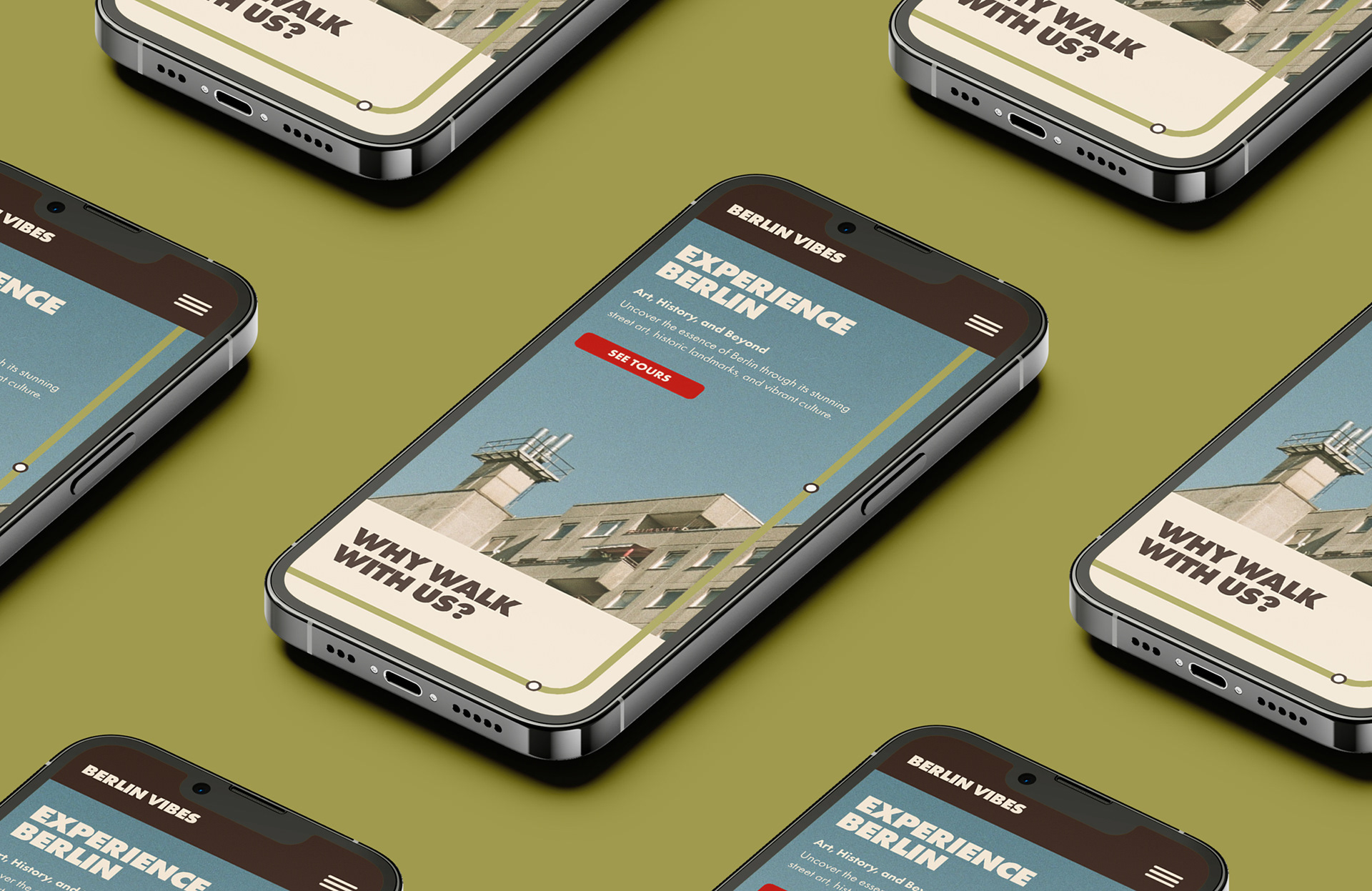
The visual concept is based on journeying through the city and its history. Taking inspiration from Berlin’s U- and S-Bahn stations, the colour palette mimics stations’ colourful tiles with a retro feel that is consistent with the atmosphere in the city where the past is beautifully intertwined with the present.
This project was completed as part of the Shillington Graphic Design course.